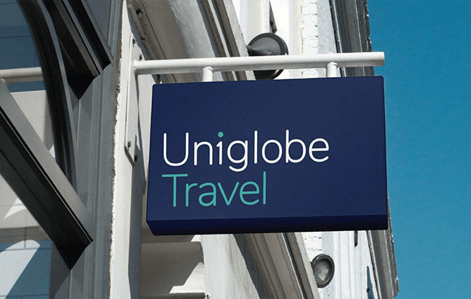
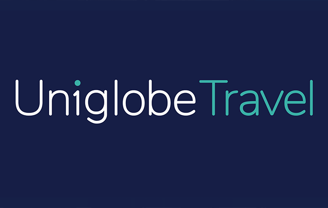
TORONTO — Uniglobe has unveiled a completely new look for its brand, jettisoning the upper-case teal UNIGLOBE in favour of a more modern Uniglobe with a stylized ‘1’ for the i, and incorporating a navy blue background to make the teal and white accents pop.
Alice Hildebrandt – Travel Technology Manager; Andrew McLaughlin – VP, Corporate Finance; Joel Kopstick, Vice President; Sonia McKeon – Director of Marketing & Supplier Relations; Dana Gain – ACV – Senior Director, Sales, Groups and Partnerships; Dean Dacko, Regional President; Robert Reed – ACV – Manager, National Accounts; Paul Jason – Director, Technology & Information Management
Uniglobe’s website has already switched over to the new look and all printed matter including banners will follow.
Uniglobe agencies will have up to a year to switch their outdoor signage.

Creating a new look for a brand that’s as respected and well-known as Uniglobe is no small task. “When you’re making significant changes to a brand that hasn’t changed in 40 years, you want to make sure you’ve got it right,” says Dean Dacko, Regional President, Uniglobe Travel (Eastern Canada).
Launching the fresh new look into a “sea of sameness” from competitors in the same field will carry Uniglobe through this new decade and beyond, said Dacko at the official brand launch.
Uniglobe was founded in 1979 by U. Gary Charlwood and opened its first location in 1981. In a video presentation from Uniglobe’s Vancouver headquarters, Martin Charlwood, President & CEO of Uniglobe Travel International, said the rebranding shows Uniglobe’s ability to adapt to rapid change. But it also “keeps true to our almost 40-year history,” said Charlwood.
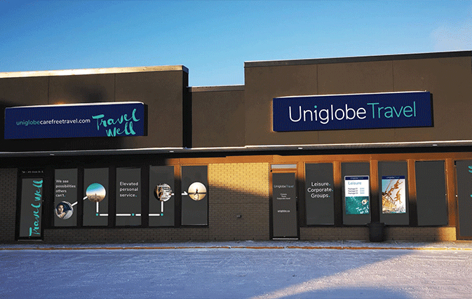
A photo illustration showing the new Uniglobe signage at a Uniglobe travel agency
The rebranding is the latest news from the company, which in November 2019 hosted its first-ever national conference, bringing in Uniglobe travel advisors from coast to coast.
The Canadian company now has 3,800 team members and locations in more than 60 countries, with annual system sales volume topping $5 billion.
A lot has changed in Uniglobe’s 40 years and now the look of the company is changing as well. What won’t change is the company’s dedication to customer service, says Dacko.
Uniglobe’s primary focus is corporate travel for small to medium size businesses and the company serves that market with an eye to flexible, adaptable and dependable service.
Uniglobe’s former tagline, ‘Travel. Simplified’, is now ‘Travel Well’. “We want to drive client success through better travel,” says Dacko. “We are client-centric. Their success is our success.”
He added: “Forty years in any business is pretty impressive. Some might ask, if it’s been that successful, why change it? Any company competing in today’s fast-paced environment needs to keep up with rapid change. You need to make sure that your customers see your brand as fresh, modern and current, and one that will deliver products and services that will be relevant.
“Our audience has changed and the market has changed. We are no longer serving the same kind of clients. Our clients are changing and we have to meet those client expectations.”
Dacko says that Uniglobe “sees possibilities others can’t. We are going to change the way people perceive corporate travel. Let’s make corporate travel exciting again.”
Uniglobe is dedicated to elevated personal service, “unrivalled SME travel experts” and local ownership that goes hand in hand with global relevance.
“Travellers today rely on us. We consider every client a family member. We are there for the whole journey. We can take that call at 2 in the morning.”
The new look, he says, is fresh, modern, relevant and impactful. “We’re really happy with it,” says Dacko, adding that the rebranding pulled in expertise on a global scale and took upwards of two years to complete.
“We’re moving forward, not backward. We’re moving forward with a lot of energy. It took us 40 years to get here. Now that we’re here, we’re thrilled with the result.”